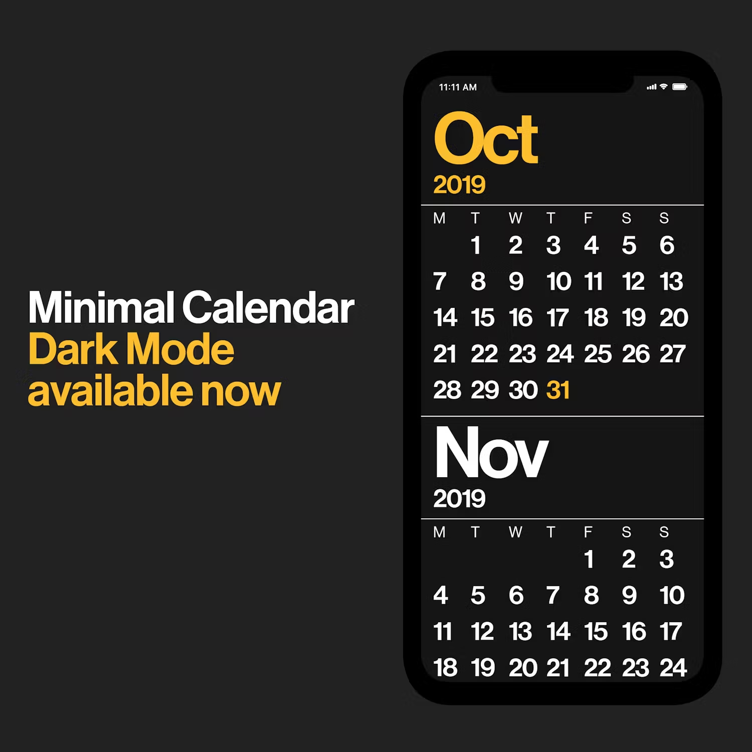
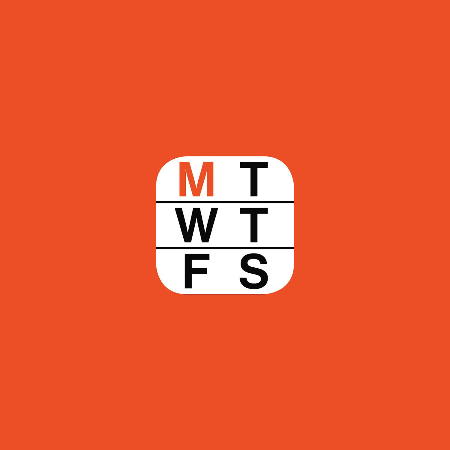
Five years ago when I designed the basics of the Minimal Calendar app experience, your average digital calendar looked like this on the right. Meanwhile, after a long road to get to Monday’s release (pre-order now at minimalcalendar.com!), its great to report back that the Minimal Calendar design has not changed at all. Meanwhile, things on the right have come from what can look like the dark ages to our eyes now.
Five years ago when I designed the basics of the Minimal Calendar app experience, your average digital calendar looked like this on the right. Meanwhile, after a long road to get to Monday’s release (pre-order now at minimalcalendar.com), its great to report back that the Minimal Calendar design has not changed at all. Meanwhile, things on the right have come from what can look like the dark ages to our eyes now.
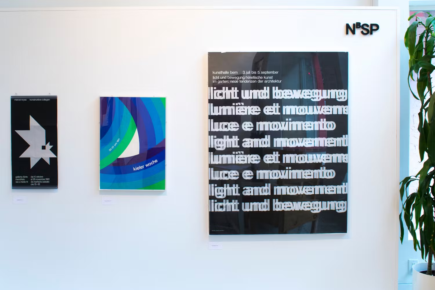
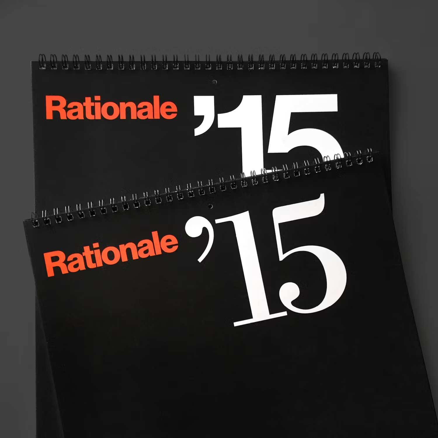
Its a microcosm showing that good design is something that can be timeless, no matter the medium. By focusing on time-tested principles of typography, color, form, and a push for thoughtful simplicity, things can last in the ever-changing digital space too.
Five years from now, this will still look good. Five years after that also. There’s no need to change it. Using the visual foundation, the experience can adapt to be the best simple experience, keeping its design language intact.
I hope you enjoy using Minimal Calendar when it arrives on Monday. With the addictive and intrusive way so many digital experiences have headed, I think there is more and more a need for products like this.
See more here.

