The following transcript is from a June 2014 interview between Rationale founder Sean Wolcott and design publication Typho.
INTRODUCTION
Q: Could you please you tell us briefly about your background?
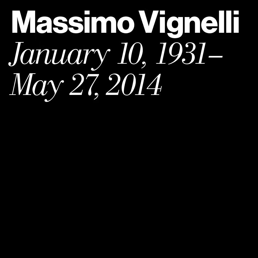
A: After growing up doing art, I found my way into design in high school. I have been practicing design in the Seattle area for the last 15 years. After starting in print production work, I continued to shift towards pure design, especially after discovering the modernist masters of the 20th century. The highlight of all this was studying and being mentored by my own personal design master, Massimo Vignelli.
Q: What is your current state of mind before we continue with the interview?
A: Busy and excited. Lots of challenging but rewarding projects currently happening or just on the horizon.
Q: What’s the thing you enjoy most about type design?
A: Typography is a foundation of information itself. Letters make up words, and words make up ideas that visualize themselves in letterforms. Societies and cultures propel themselves with written language and its discourse, so why not seek to master the visualization of such medium?
Q: Can you tell us a little bit about your creative process?
A: My creative process is fairly consistent. For design projects, it’s all about finding a solution to a problem, so step one is to best define that problem for myself and the client so that I may seek a proper solution. It is about searching and investigating to find a highly-charged visual and conceptual essence. The unexpectedly expected.
Q: What does graphic design means to you?
A: Paul Rand said design is the “manipulation of form and content.” In the digital world today, we are dealing with design of experiences that manipulate form and content over time. Design to me is a way to make the world a better place.
Q: What inspires you?
A: The endless wonder and surprise of the creative process itself.
ON THE LIGHTING FIRES PROJECT
Q: Could you briefly discuss the idea behind the identity of this book series?
A: This book series needed a design language that could stem from the cover concept and then apply to the interior contents as well as data visualizations and more.
Q: What is the concept behind it?
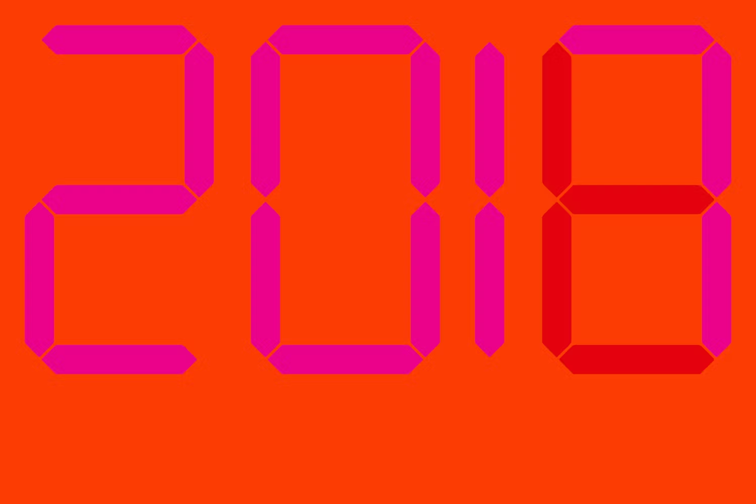
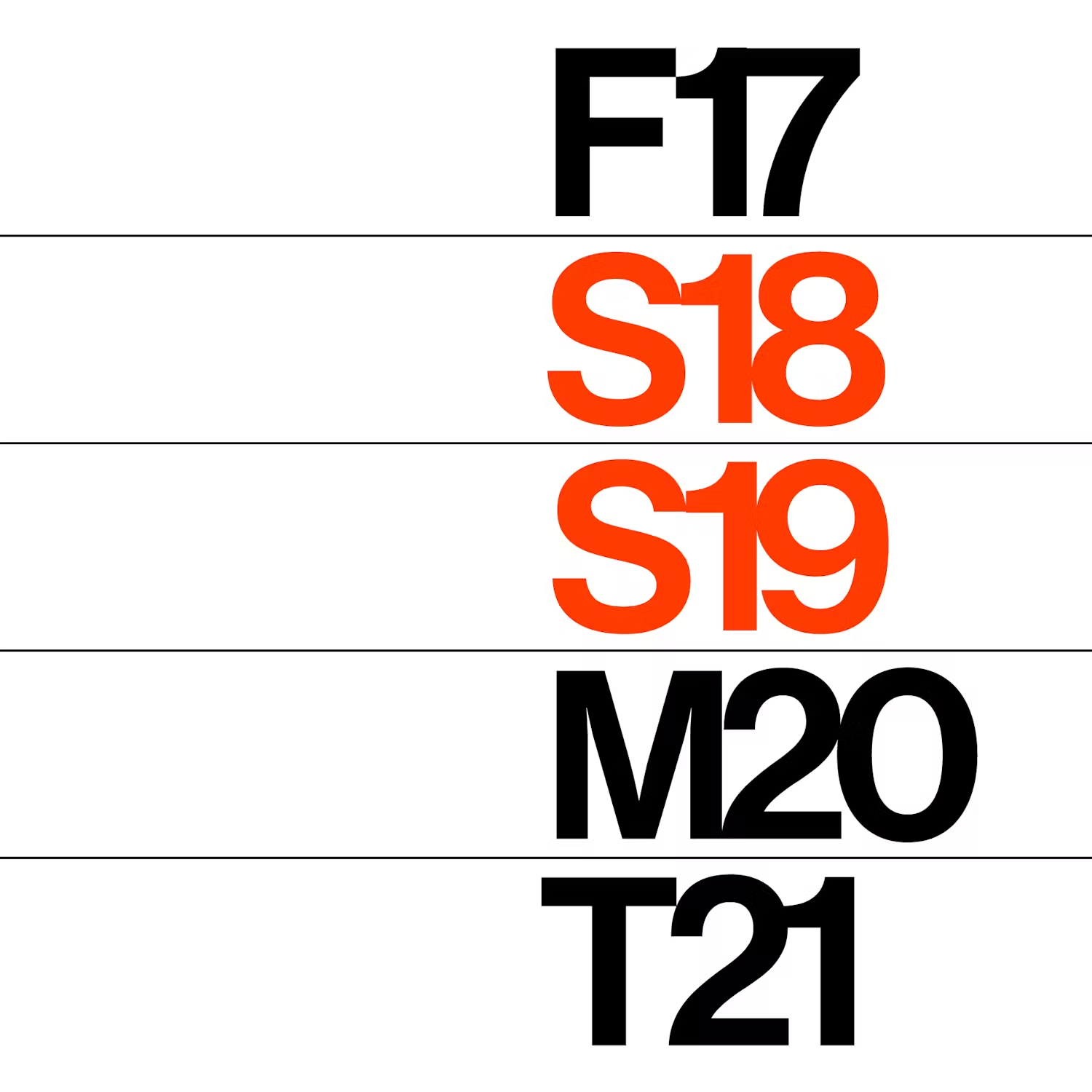
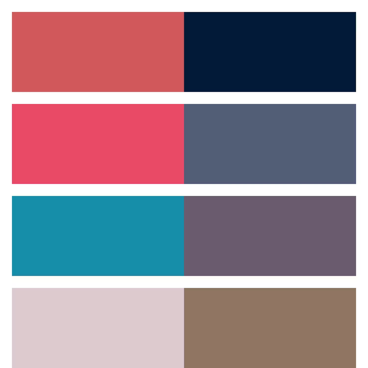
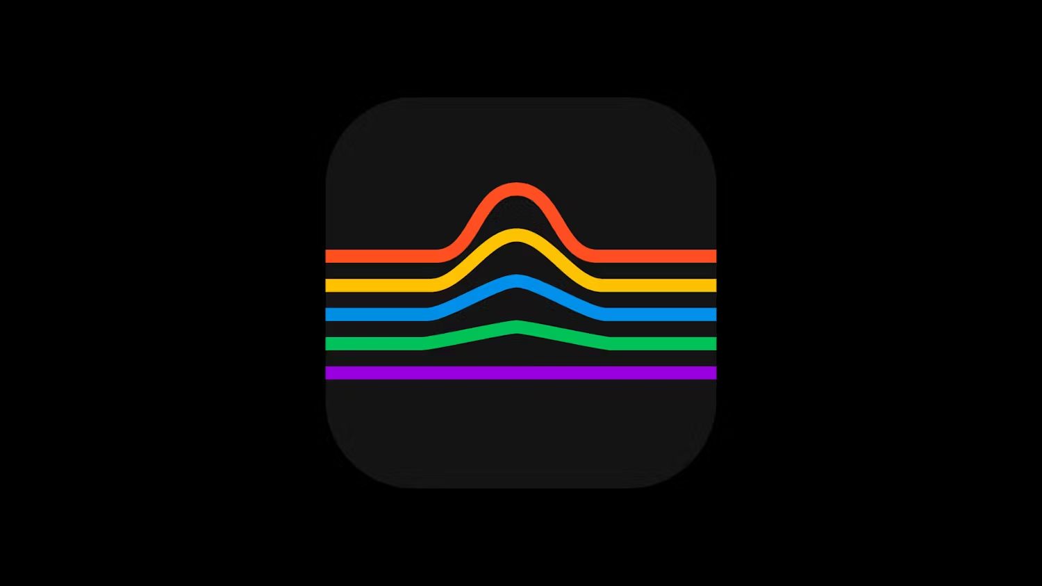
A: The imagery addresses the notion of an impactful growth of ideas and movements kindled over time. The visualization of this is represented through sequence and geometry, showing fire as digital abstraction. Color and form shift systematically from panel to panel, growing in hue and saturation.
Q: Why did you choose to use a very strict grid and typeface such as the Neue Haas Grotesk for this project?
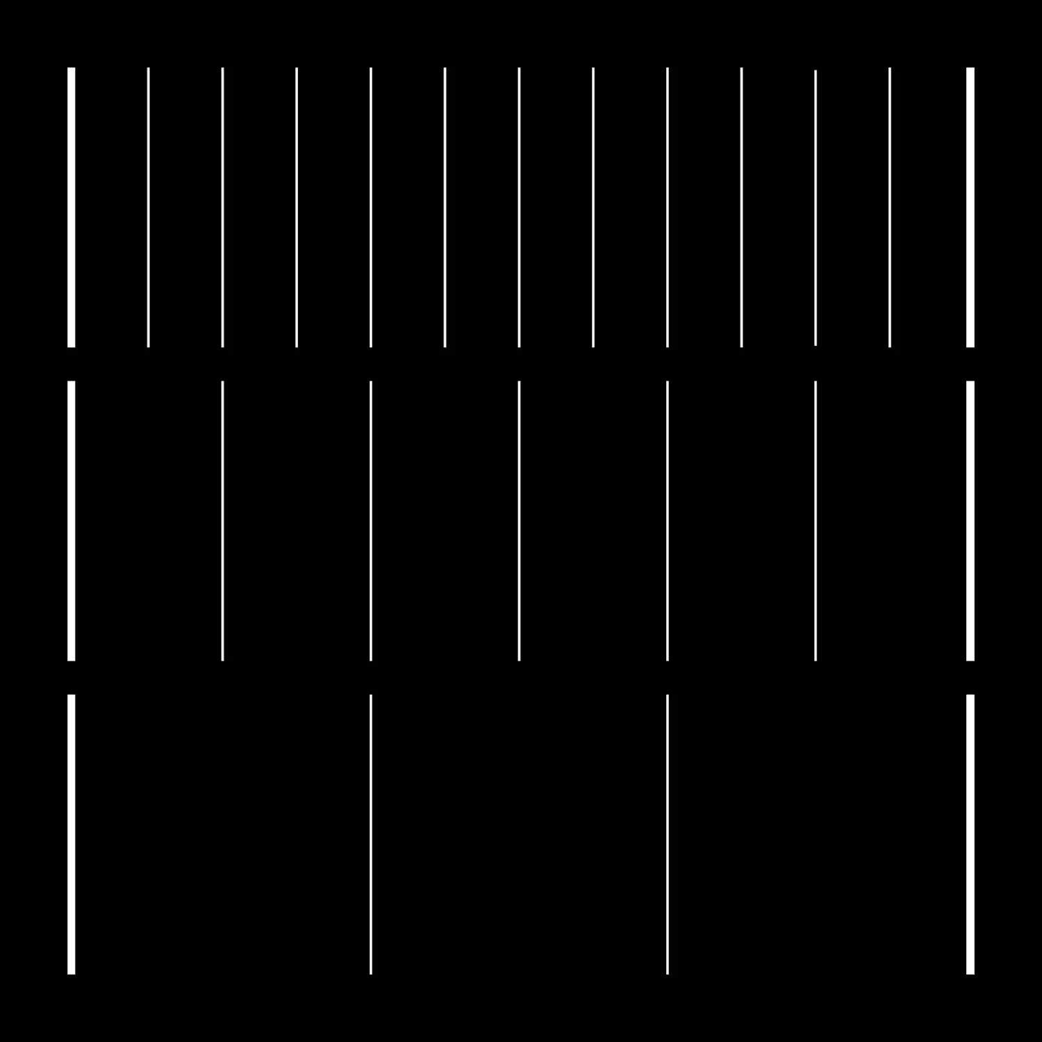
A: The foundation of a strict modular grid is always the best way for information design. You can make your composition as loose within it as is appropriate, but in this case the strictness reinforced the notion of snapshots of a time sequence. Neue Haas Grotesk is a beautiful and refined typeface that gets noticed yet stays out of the way all the same.
Q: What do you think a cover like this could communicate?
A: I think it can be specific in its meaning, but also intriguingly and positively ambiguous.
Q: What do you think is the most important thing to understanding this project?
A: There is a deep meaning embedded in the visuals, however the comprehension of this comes second. The first goal is to entice the viewer on its aesthetic impact and to get noticed in its clarity on the shelf (physical or digital).


