In 1983 acclaimed and influential industrial designer Dieter Rams coined ten principles for good design. Seeing a shift towards a consumeristic mindset and a flood of products with built-in obsolescence reaching a dangerous level, what each of us intuitively expects in a product began to be swayed, standing at odds with something that is designed to last.
For us at Rationale, we find these ten principles that follow as resonant today as ever. While these principles were conceived for the tactile nature of industrial design, we see them as equally relevant in the landscape of endless disposable digital products, both literally and figuratively. Increasingly product intent is solely financially motivated and digital products become intrusive, deceptive, addictive, overwhelming, and quickly obsolete.
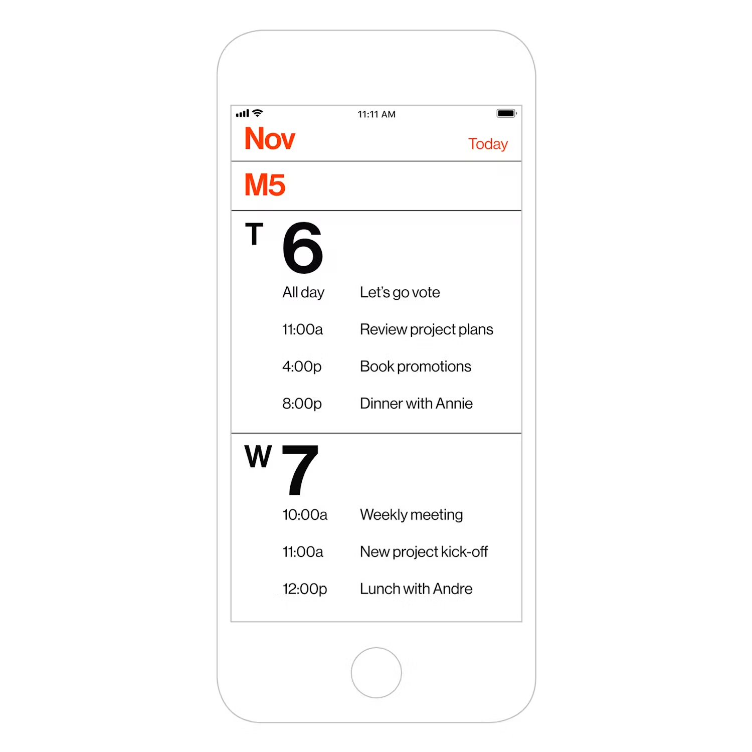
With our new iPhone app Minimal Calendar, Ram’s ten principles have been applied to create something lasting and meaningful:
1 – Good design is innovative Mies van der Rohe said “Don’t try to be original, just try to be good.” Innovation should not be the goal but a byproduct of solving a problem thoughtfully. The entire purpose of our Minimal Calendar app is to make something “Less, but better”.
2 – Good design makes a product useful Every design choice, feature, and element has been thought through with great detail to be as helpful as possible to you the user, and we seek to refine this continually.
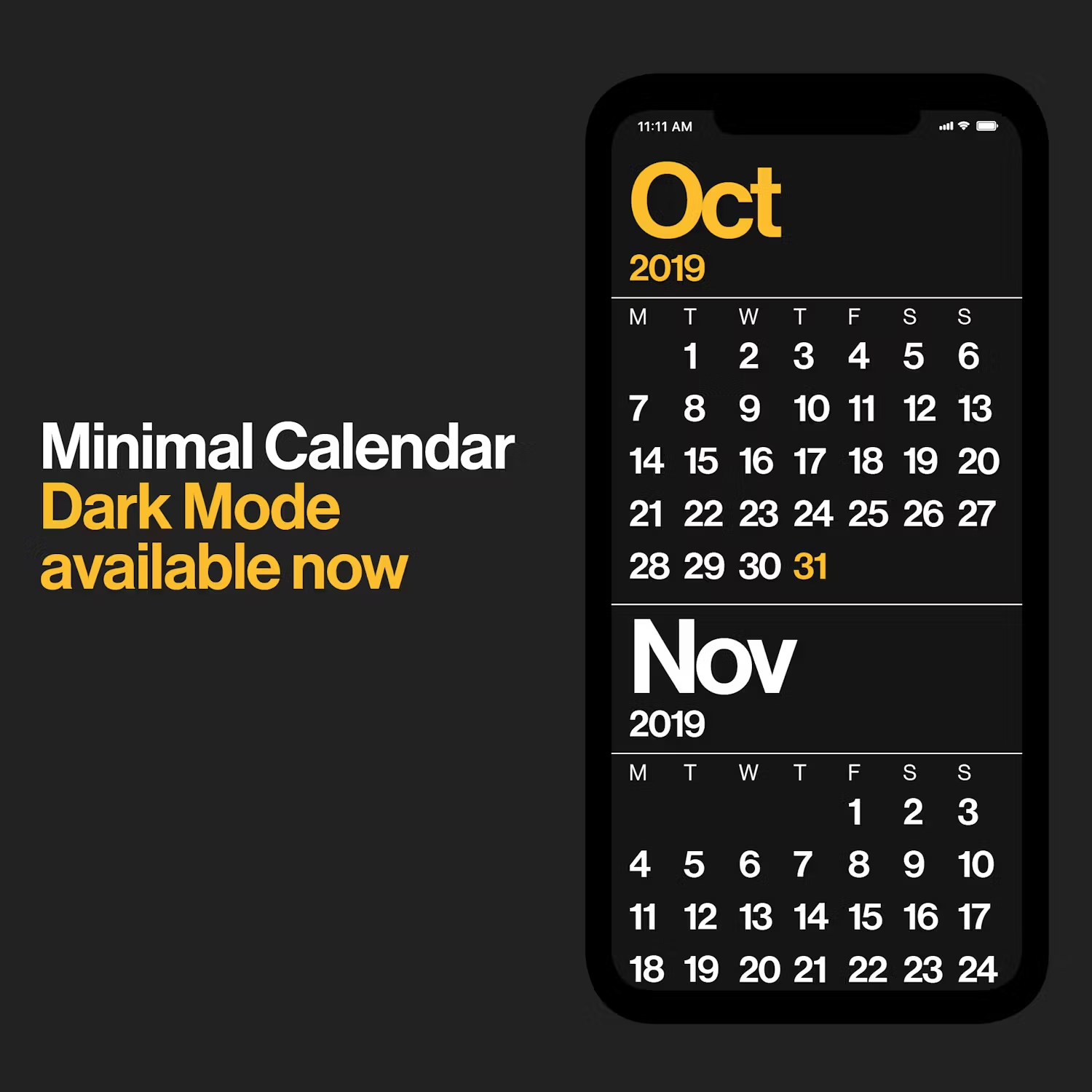
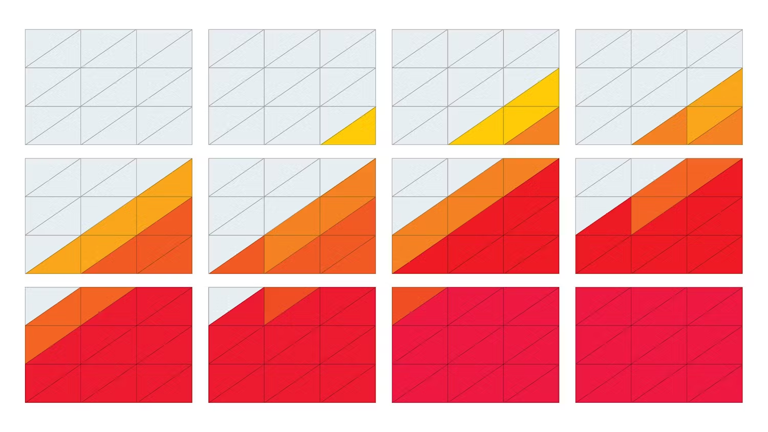
3 – Good design is aesthetic The aesthetic choices we made are to increase the usefulness of the product. In a busy world and lives, a beautiful typographic view exists to give you only what you need and none of what you don’t.
4 – Good design makes a product understandable As another byproduct of our deep and extensive design exploration to the end product, we are happy to see our users easily grasping the intuitive layout of the application. Fewer possibilities means more of a focused and clear experience.
5 – Good design is unobtrusive The point of the app is not to create an absence of clutter in itself, but to make what is meaningful to a digital calendar experience as unobstructed as possible. Fewer distractions mean less time to get what you need, and back to life.
6 – Good design is honest We only sought to highlight the core elements of the experience through an inherently beautiful presentation of numbers and letterforms. Nothing overdone, no faux material textures or other gimmicks – just what you need for making what we believe is an honest design.
7 – Good design is long-lasting The core experience of the app was created in 2013. In those five years, it’s shocking to see how much digital experiences have changed. We are pleased to report that the design done for Minimal Calendar five years ago remains the same one we shipped in 2018.
8 – Good design is thorough down to the last detail We left nothing to chance and agonized over every aspect of the design. From the specific colors, tints, sizes, placements, interactions, screens, and flow of the user within this system, we wanted to build a product worthy of your time.
9 – Good design is environmentally friendly In the digital space, we don’t have the same waste of physical resources, but despite that, a waste of time is a waste of energy which ultimately takes its toll on nature. We strived to build the foundation of the experience to last instead of something that always wastefully changing to fit the needless fashion of the moment.
10 – Good design is as little design as possible Nothing more. Nothing less.
We hope that in using Minimal Calendar you can see how this has been taken this to heart, and with it find an unparalleled level of clarity and beauty.
Minimal Calendar is available for iPhone now!

