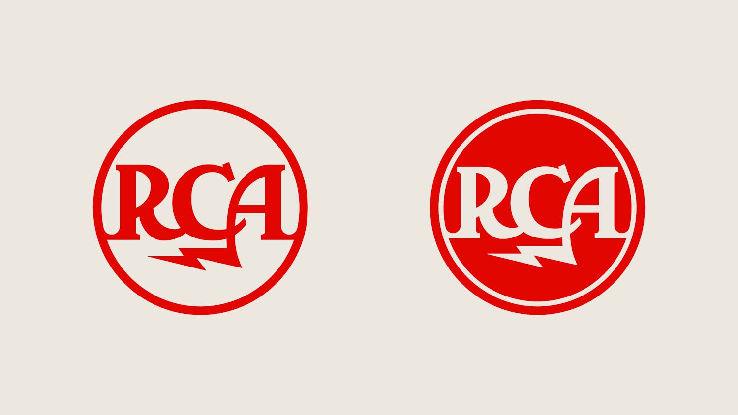
For RCA, their legacy logo graphics had been digitally rendered for too long in a way that did not hold up to their classic legacies, often inconstant and falling short of their pre-digital analog-perfected designs.
For RCA, their legacy logo graphics had been digitally rendered for too long in a way that did not hold up to their classic legacies, often inconstant and falling short of their pre-digital analog-perfected designs.
At Rationale, we took our decades of design experience and the unique intersection of musical branding knowledge, meticulously researching and painstakingly restoring the company’s original 1920s lightning bolt logo (aka the “Meatball”), which involved reviewing countless inconsistent analog versions and making choices to determine the best of them, iterating for weeks to get the perfect curves, balance, and determine any embedded visual systems hidden inside. This same meticulous approach extended to the 1968 RCA logotype (seen on album covers and appliances for decades worldwide). This included creating digital variations of the 1968 logotype versions (solid, stripe, and color stripe), going so far as to track down and consult original designer Gene Grossman (now in his 90s), and confirming our assumptions and choices aligned with his team’s original intent.
The result is a restored set of RCA logos that serve their original design intent, becoming the new defacto versions for today and tomorrow.


